ABOUT THE PROJECT
Ricchia
Project type
Time lapse
Designed with
WEBSITE
06. 2025 – 08.2025
Figma, RIVE, Illustrator, Photoshop
Ricchia is an apulian restaurant located in Brera, one of Milan’s most important zones.
The old website needed a redesign that could compete with the always changing food trends and modern restaurants.
CONTENTS
🎯 What’s the goal?
In the past couple of years, the world of design in the food market has changed quite a lot. What once was not needed is now a must in every new food place. And yes, we’re talking about design.
Every restaurant or food-related shop is trying to keep itself fresh with the always-changing design. In the past years we have seen all sorts of new trends, from mascots to big-and-bold brandings.
Unfortunately, the old Ricchia’s website could not stand up against these new places, so a fresh redesign was needed.
The goal of this redesign is to compete with other similar places with a strong design department. But there’s a catch: redesign it in a way that can last longer than the trends themselves.
🗣️ LET’S TALK DESIGN
Ricchia branding could be defined as modern traditional. Being an apulian restaurant, the respect to the tradition is necessary but, in a city like Milan, it needs to appeal to the more modern audience.
Warm colours and organic shapes define the design, with new font choices that keep a fresh and modern style.

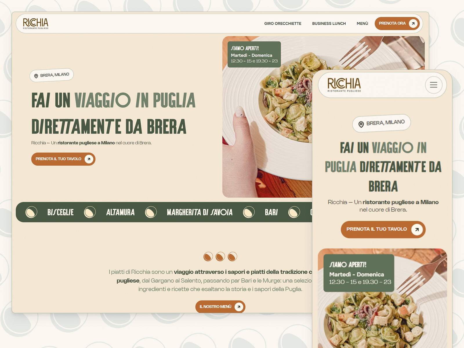
📲 MOBILE FIRST
82% of the old website’s traffic came from mobile.
If we sum this to the fact that I am a strong desktop lover, we have to find middle ground on how to build both versions:
- In the mobile version, the key element was the utility. Let’s be honest, you visit a restaurant’s website to do only three things: see the menu, discover more about the food and book (from mobile, we could even argue about one of the three). This just means that, in this platform, the website has to be beautiful to see, but useful at the end.
- In the desktop version, as we have more space, we can play more with sizes, contrast and elements to make it more impressive and eye-catching.
At the end, it is more satisfying to see it from desktop but, from mobile is easier and faster.

💃 IF IT MOVES, IT’S ALIVE
How can we make a website that feels modern, knowing how little information we have to offer? Let’s animate.
I have always been a fan of dinamic websites, with unique animations that make it feel alive. Done the right way, it is beautiful and entertaining. But, done wrong, it becomes a confusing mess.
The guide I used for dinamic elements was simple: animate the little elements that will not change the overall structure of the page. With this advice, we don’t risk having adaptability issues and confusing users that are more used to the traditional web structures.
